welcome to "header"
designing a header bag for a product in a series of three.

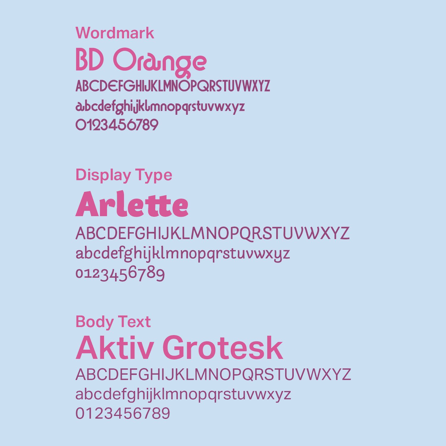
typography
the logo wordmark was to be clean while retaining some elegance and playfulness with bd orange regular.
arlette was chosen for the item name and tagline text for its interesting but not overwhelming flourishes.
aktiv grotesk was used for all body text for its versatility, with many different weights giving it a unique appearance.


logo concepts
package
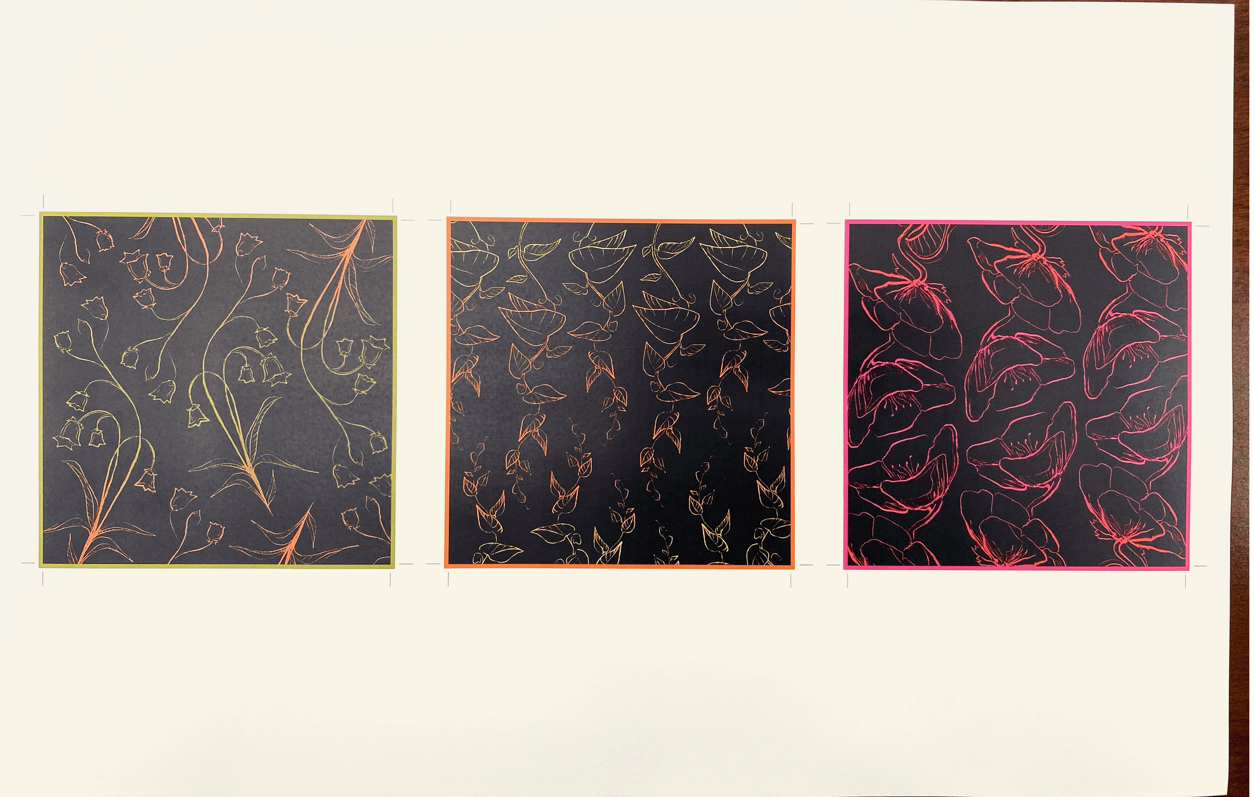
the header designs in their raw physical forms. the dark pattern is featured on the inside of the cardstock headers, while the colored side folds down the middle to become the front and back.

gallery
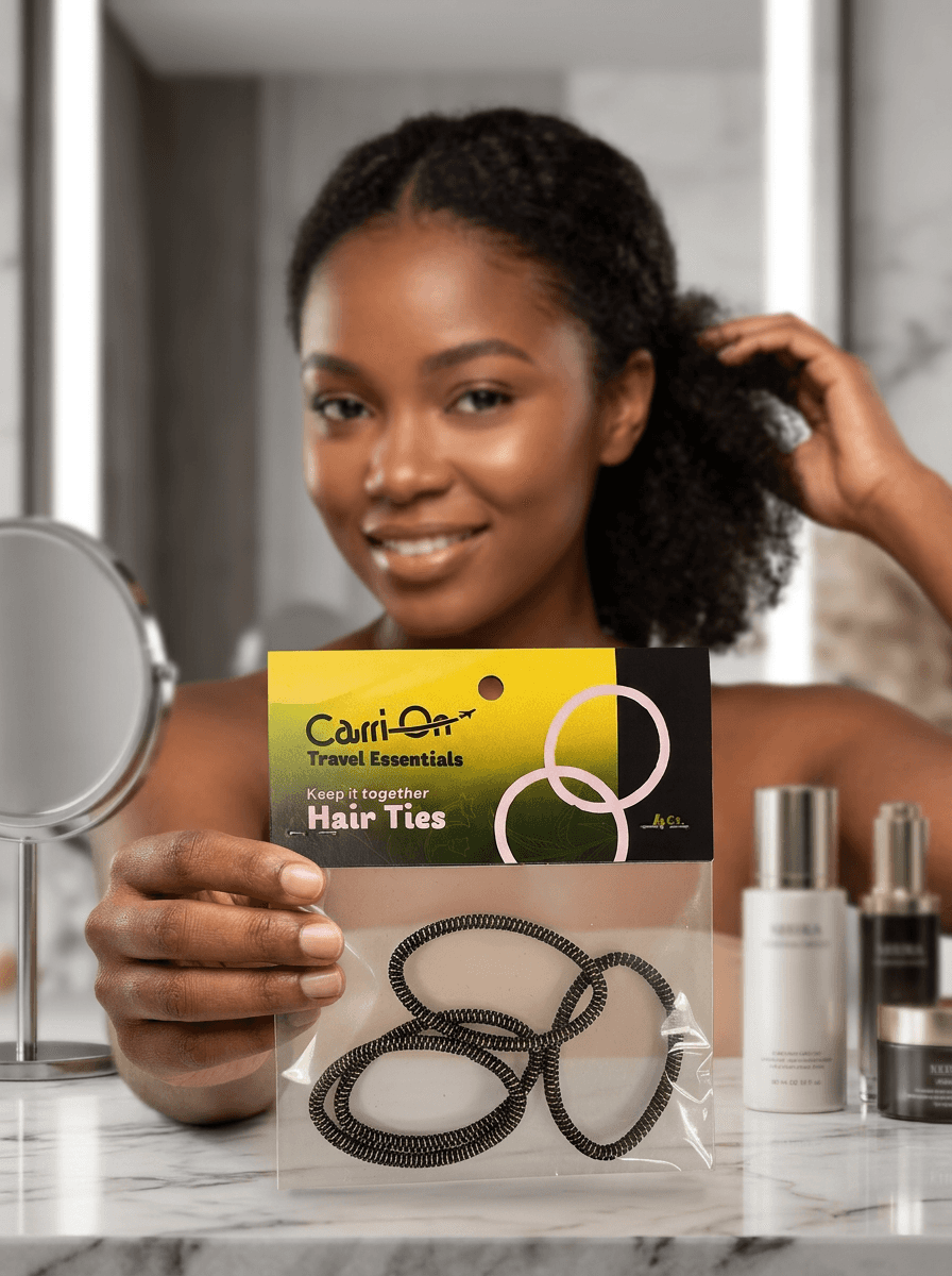
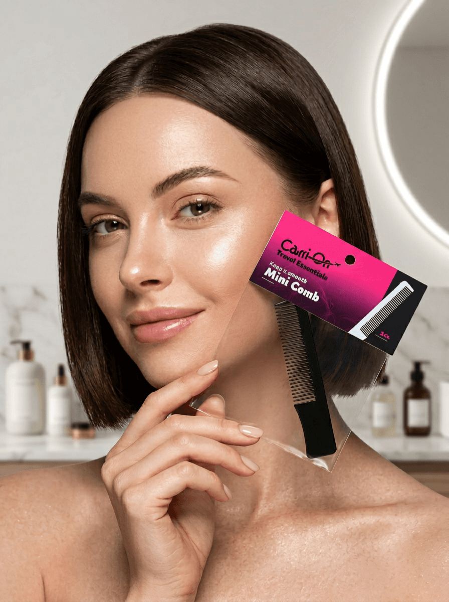
a sample lifestyle photo shoot of each of the three items with the header package within view, to promote the product and showcase the design itself.

the brief
choose a small item (one of three variations) and design a series of three header bag graphics with a cohesive visual system while also making each of the three entries unique.
the fictional brand i developed is titled "carri-on," a by-women-for-women company that creates travel-sized items. this series features personal hygiene items.
illustrations
each header bag graphic contains a unique floral motif that is subtly visible on the front and back of the card. you know why? because the target audience is women and flowers are what i attribute to that so there they are.

final logo in color
design only
a showcase of the fronts and backs of each header: the mini comb, floss picks, and hair ties respectively.