welcome to "pillow pouch"
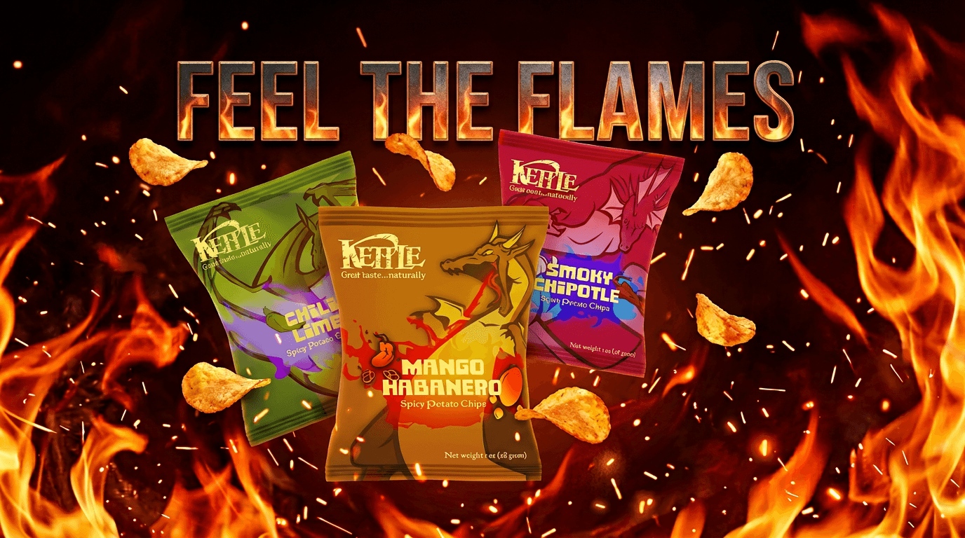
designing a pillow pouch bag for three new flavors for "kettle" brand chips.

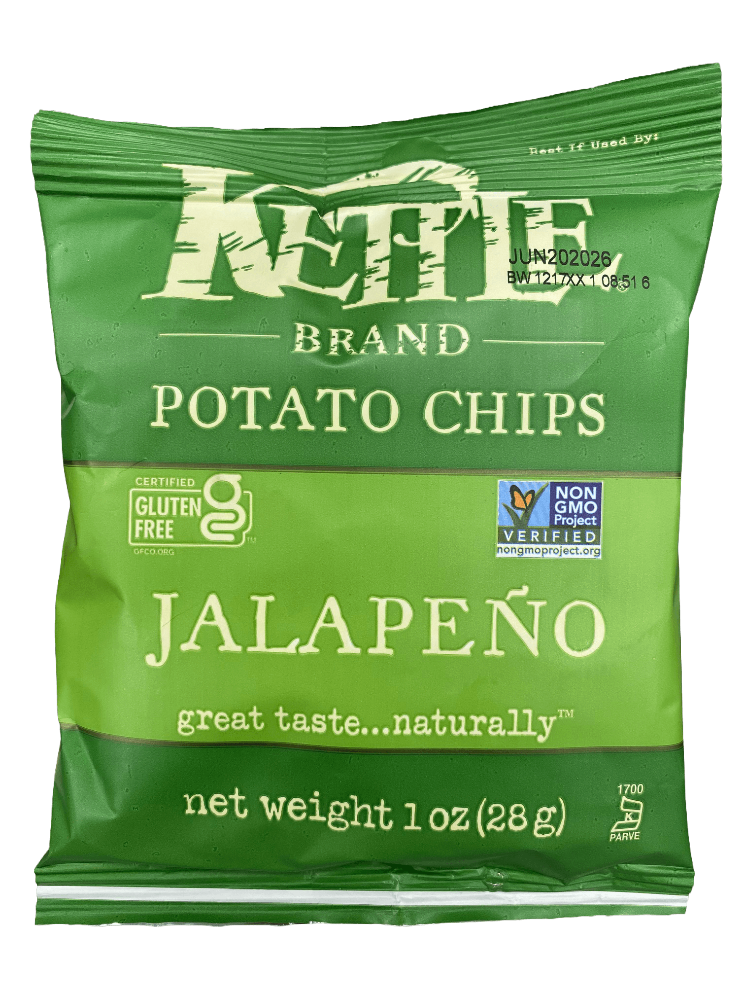
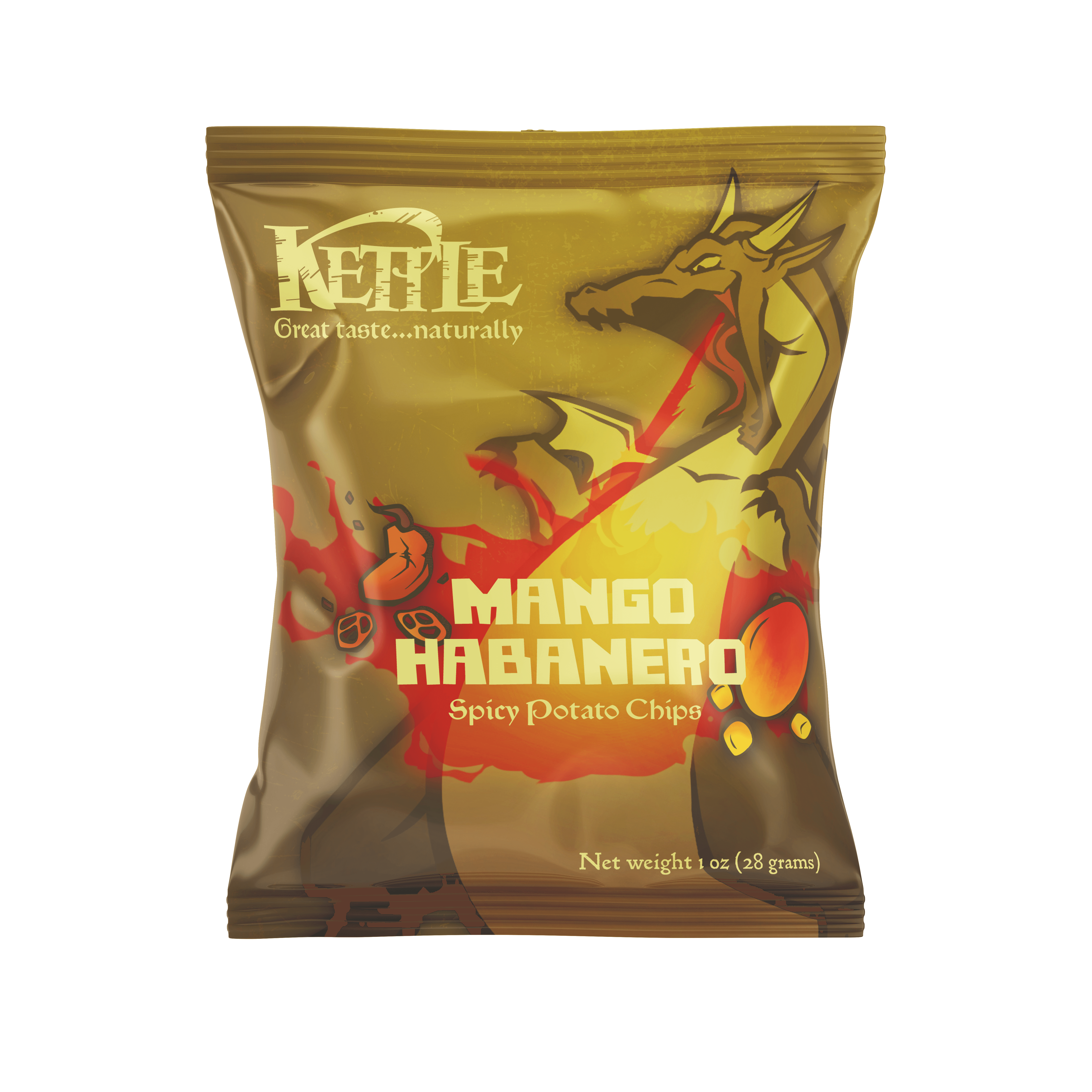
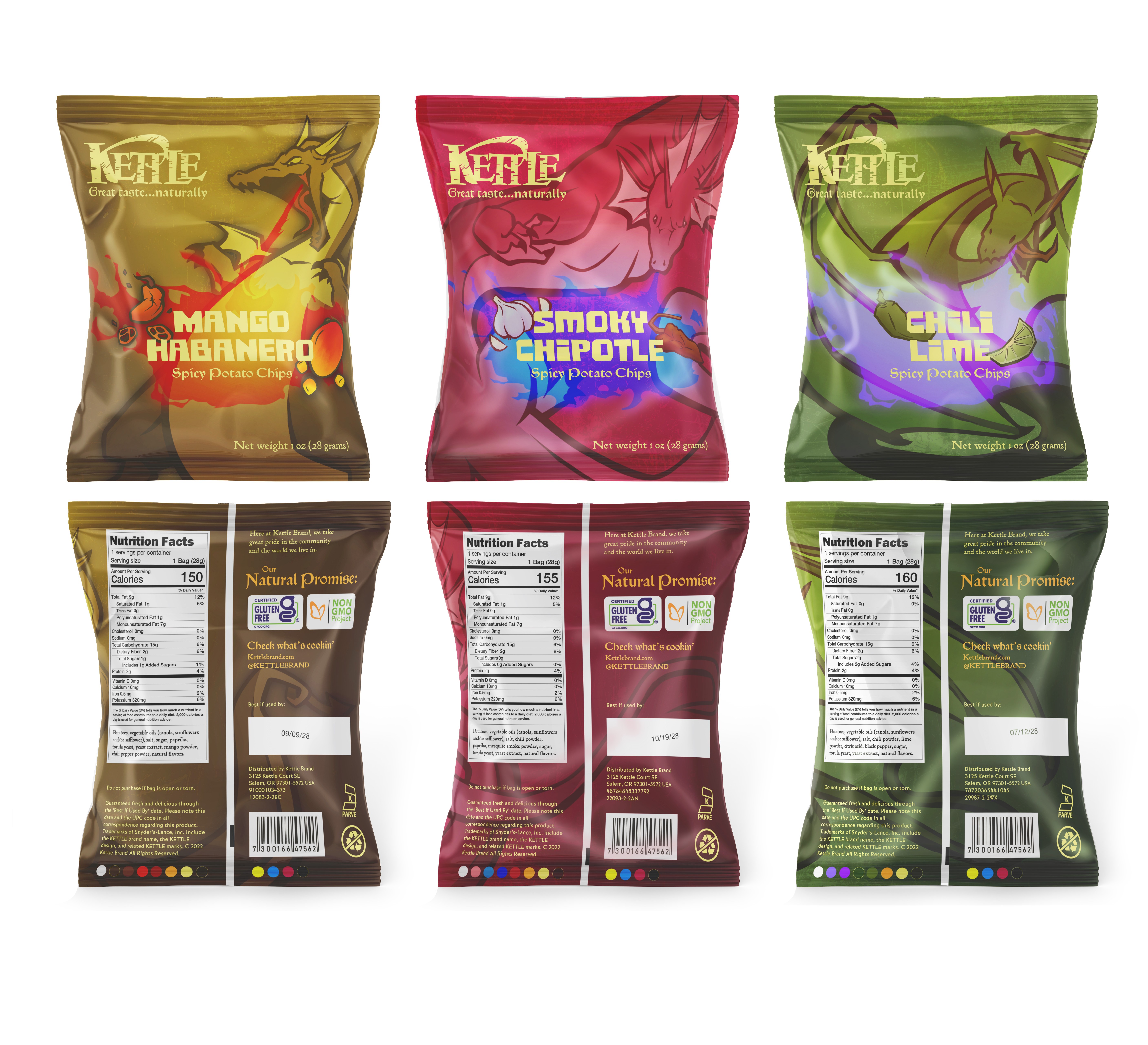
old design
typography
comrade bold was chosen to represent a more playful side of the theme. used to disclose the flavor on the bag.
morris troy and morris golden are loaded with personality, but with the latter being more suitable for highlighting a section within body text. morris troy would serve as an accentuating dose of medievalism to accompany the dragons.
bernhard gothic medium is highly legible and was used on the less intriguing content of the package, such as distribution information.
package build
the illustrations were designed around a text build made in adobe illustrator, then sent off to be drawn over in procreate, where the dragons and flavor images were drawn so that they would compliment the composition of the text instead of fight it. each image was given a dark gradient for the back side of the bags to ensure text contrast would be retained across all background colors.

the brief
find a liquid product intended for consumption and redesign its packaging to accommodate two fictional flavors. Includes designs for new labels, a sleeve that holds both bottles, and custom - printed 3D caps.
new design


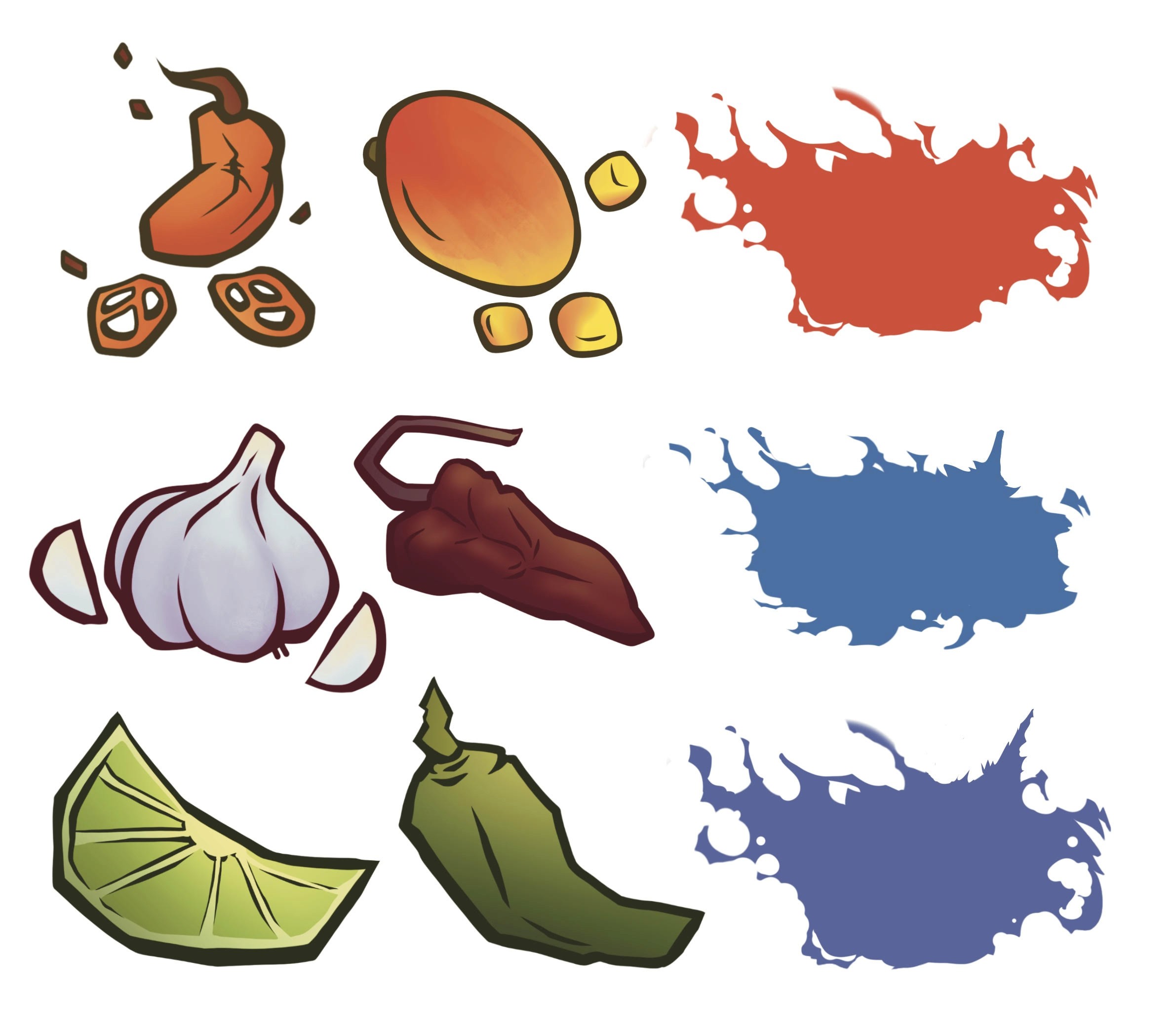
illustrations
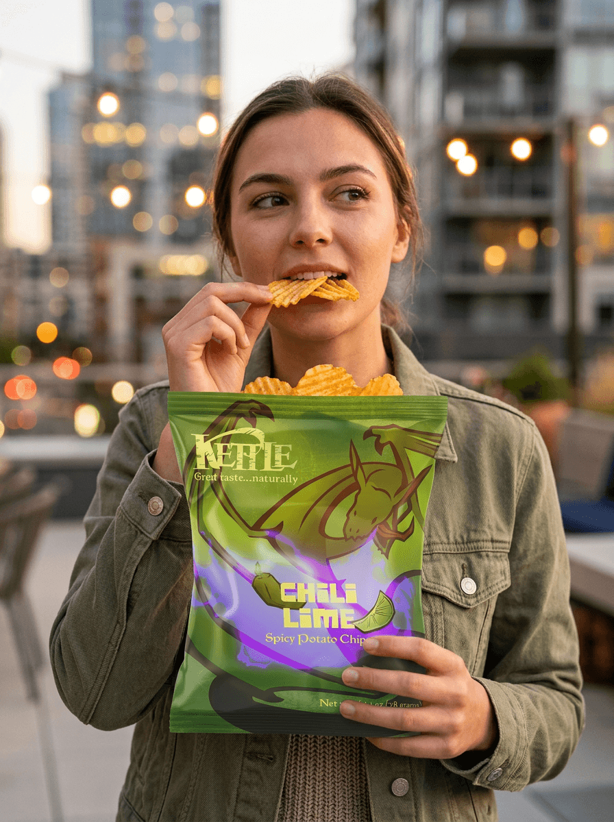
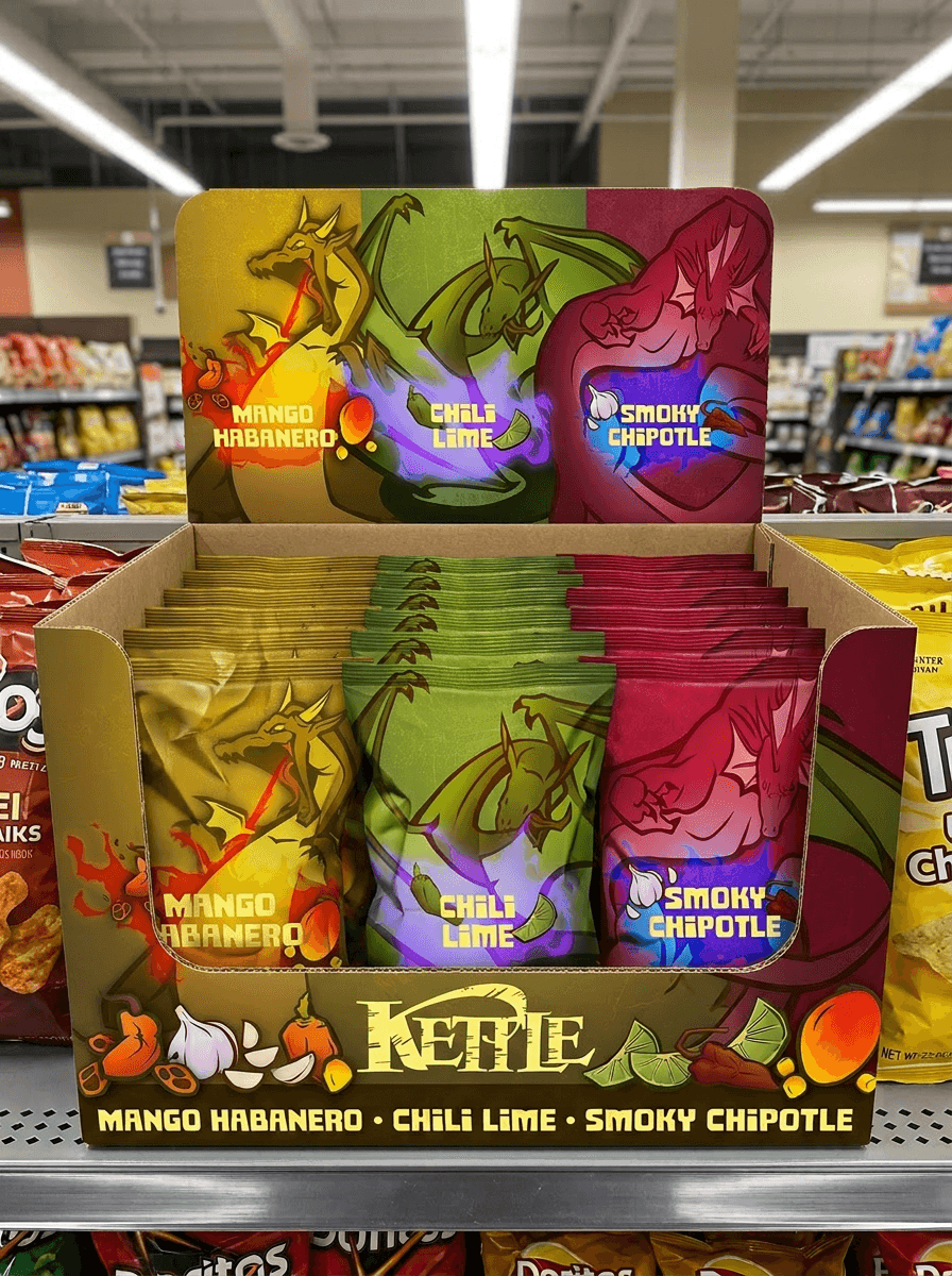
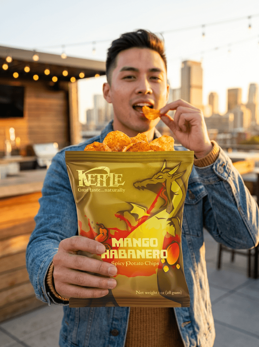
gallery
a showcase of the individual bags and all three together in the wild, both in a retail setting and with consumers.